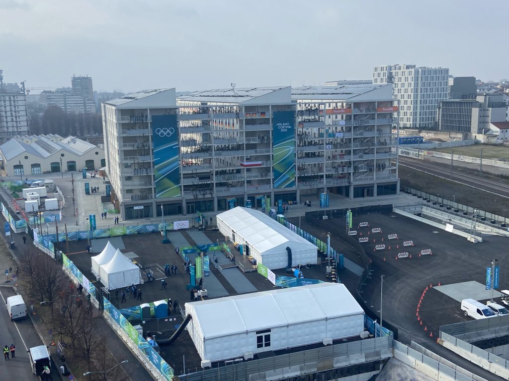
In Milano Cortina, design isn’t the “nice layer” on top of sport. It’s the system that turns speed into meaning.
Start with the Olympic Village: the rooms are intentionally minimal, almost neutral. That’s the frame. A space designed to be repeated hundreds of times, identity arrives when the young athletes says this is our place for now through colour and small gestures: flags, a corner of green, home souvenirs. And when an entire team shares the same building, that simplicity does something powerful: it amplifies belonging. It becomes a collective structure to focus, to be calm, hopefull and safe a fortress.
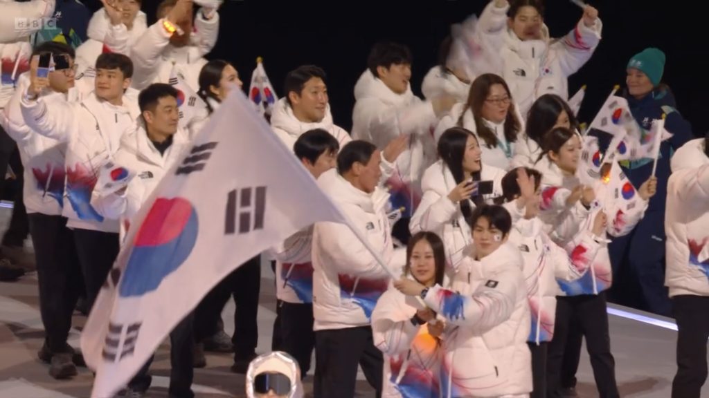
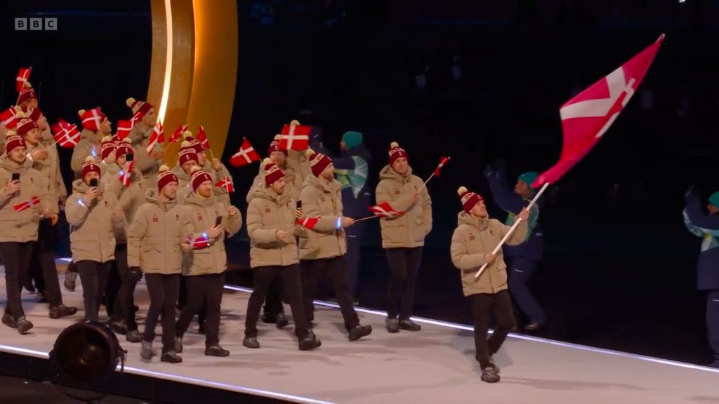
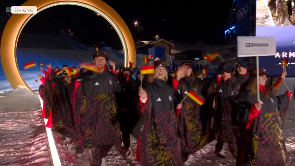
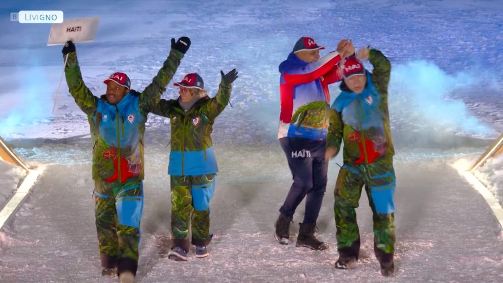
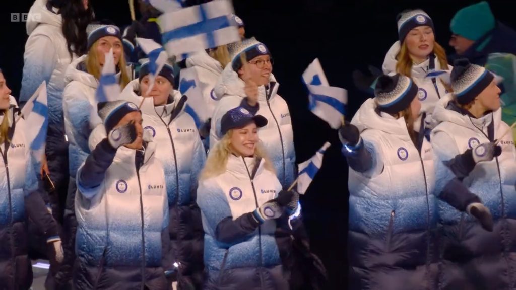
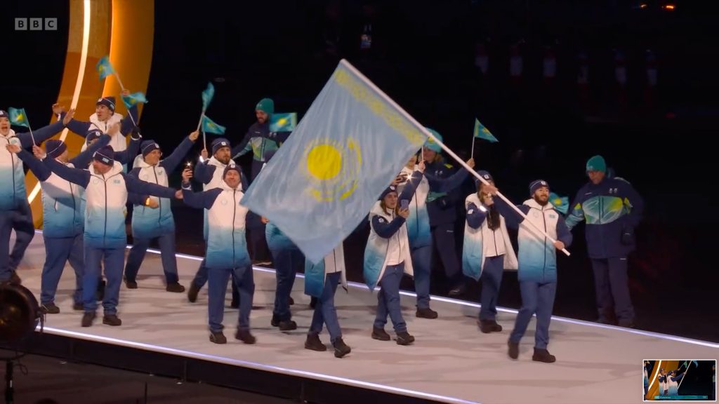
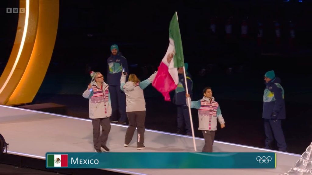
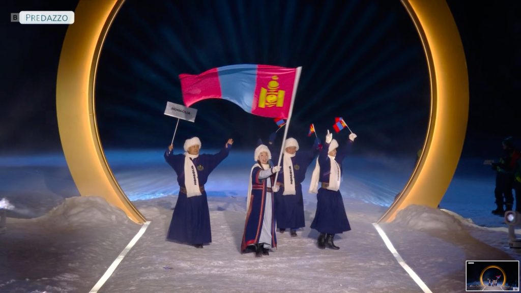
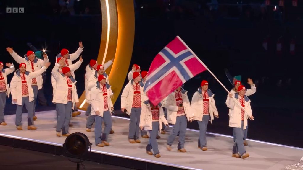

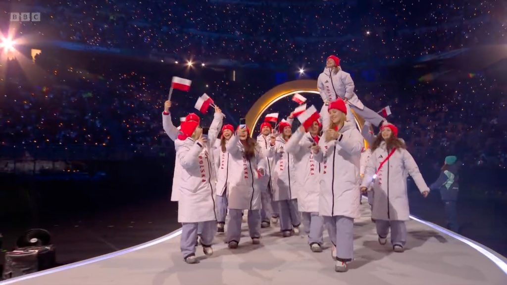
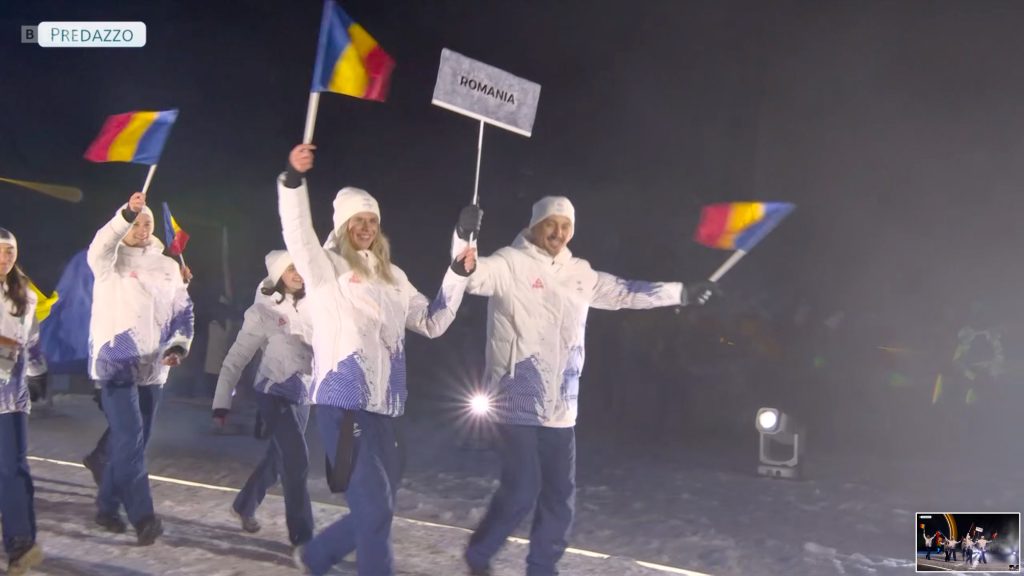
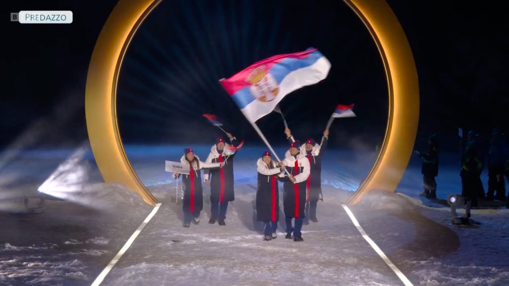
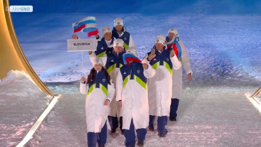
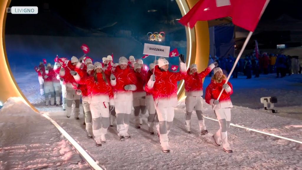
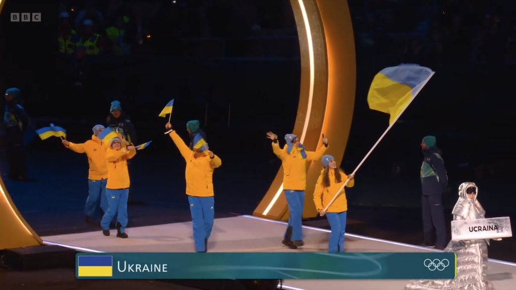
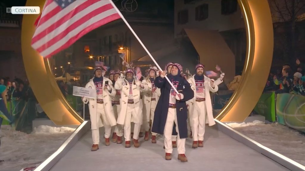
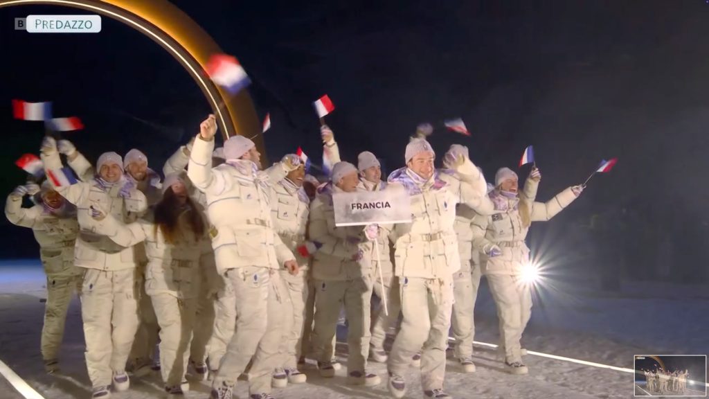
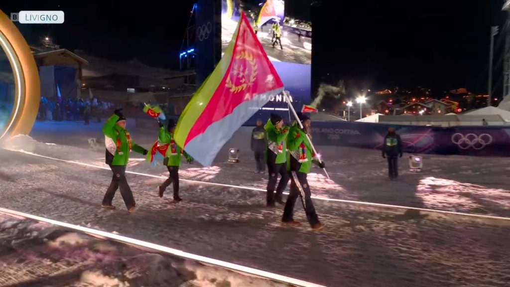
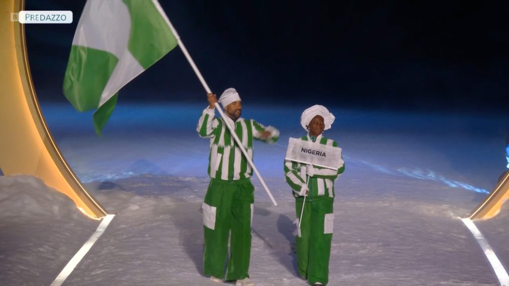
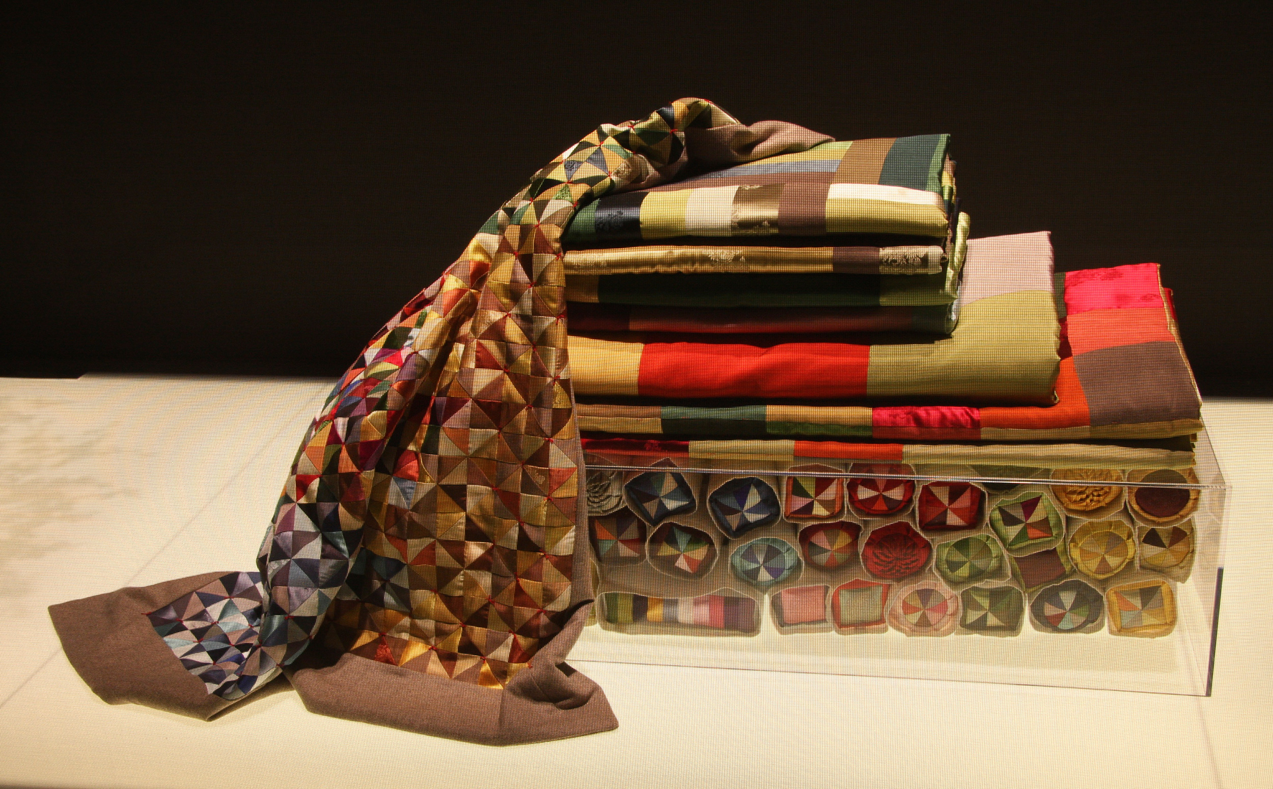
The same logic appears in the uniforms. During the opening ceremony, every country becomes instantly legible as a whole: not through names, but through colour blocks, silhouettes, and visual rhythm. It’s about perception, branding and psychology. We don’t just recognise teams; we feel them, as a single moving composition. Then the poetic part tightens into engineering: performance textiles, aerodynamic cuts, and micro-decisions in construction, all chasing the margins where races are won. In winter sports, a few tenths can separate the podium from anonymity, design is one of the few tools that can still bend that outcome.
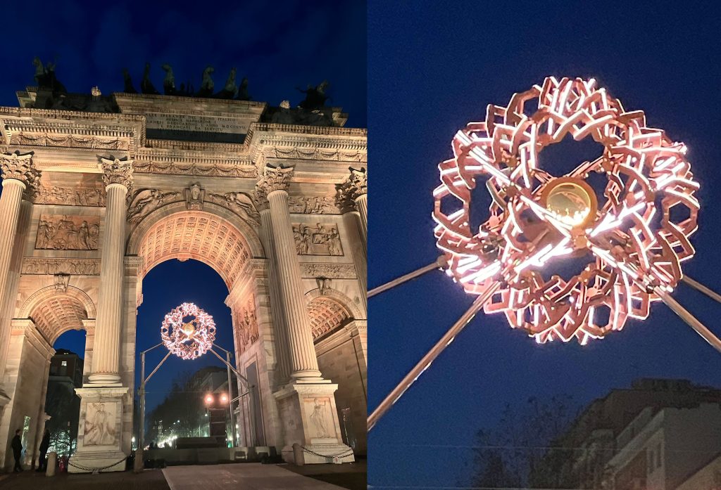
And then the object that carries the most symbolism: the flame. The “Essential” torches push Italian minimalism to its most emotional form: everything reduced so the fire can be the protagonist. But this is also contemporary design at its most responsible, designed by Carlo Ratti Associati: it’s made with a strong sustainability brief largely recycled alloys, a bio-GPL fuel system, and lightweight components designed for reuse/refill. The ritual becomes technical without losing its soul. Even the ceremony expanded the symbolism:two cauldrons one lit in Milan, the other in Cortina, different locations turning the flame into a shared landmark visible, collective, and intentionally “never going out.” Innovation serving continuity, technology carrying a promise.
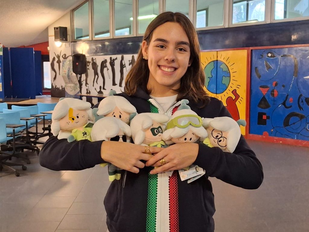
Even the mascots work like good design should: simple shapes, immediate warmth, and a story you can read at a glance. And there’s a personal thread here, too: Noemi Sanna, one of the young illustrators creator of “The Flo” (the Snowdrop flowers, icons for resilience made to travel across languages) also collaborated with Minrl through a P.C.T.O. programme, proof that big symbols are often built from small, patient acts of drawing and making. If you’re curious, the story is here: https://minrl.com/blogs/stories/minrl-and-the-pcto-program-growing-together-through-art-sustainability-and-craftsmanship
There’s something beautiful about that: the Olympics can feel enormous and untouchable, and then you realise how often they’re shaped by a young hand, a familiar line. Resilience, strength, continuity: from a notebook to a stadium. Just like every athlete who has been waking up early since childhood, repeating the same gestures day after day, until a dream becomes real enough to stand here ❄